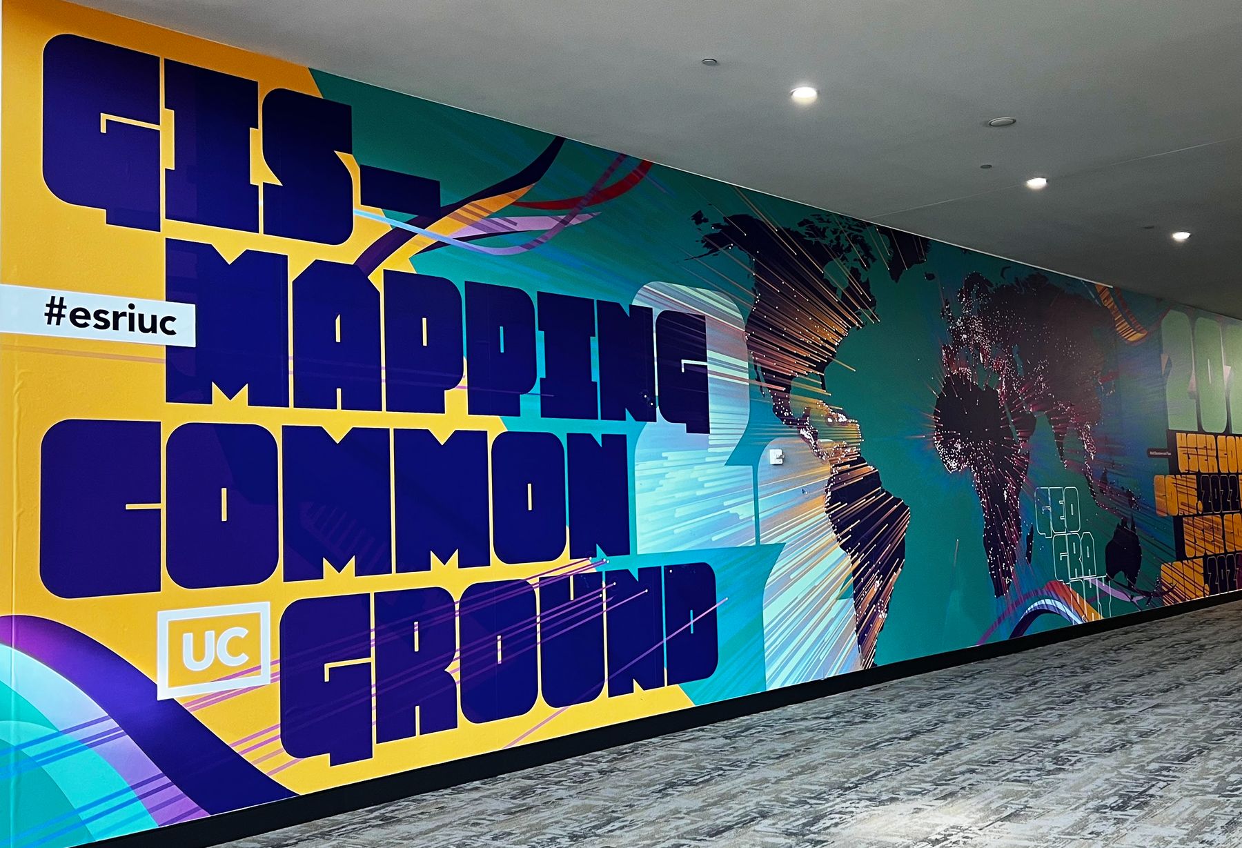
In early July, three of us from the Our Towns team – Deb Fallows, Ben Speggen, and me – traveled from Washington, D.C. to San Diego for the first in-person global User Conference (UC) since 2019 of the digital mapping company Esri, which we’ve referred to so often on this site. (And which is a partner and supporter in our work.)
At its peak before the pandemic, the annual Esri User Conferences gathered nearly 20,000 people from around the globe. This year some 15,000 people reconvened – a remarkable rebound, and by far the largest in-person event that Ben, Deb, or I had attended since the “before” times.

What was the message of the gathering? In a recent Substack post, I highlighted one of the main breaking-news developments there, among the hundreds of tech-specific tutorial and demo sessions it offered. That was the preview, days before its official announcement, of a new White House data portal called HEAT.gov.
- The easiest way to explain the power of this site is to say: please just go to HEAT.gov and see all the information that is collected there. Then please return after you’ve checked it out! But I hope you will consider that site, and this one, as places to visit frequently.
- The second-easiest way is by analogy. Starting early in 2020, public health experts at Johns Hopkins University put together a “Covid dashboard” that became one of the most-visited web sites in the world. Most people reading this post will at some point have visited that site—it has had many billions of views. Its power is a combination of “normal” data (infection rates, hospitalizations, death totals, vaccination levels); map-based presentations (of cities, counties, states, countries, the world); and very deep interactivity. You could zoom the map to any part of the Earth you cared about; you could choose which trend-lines to compare on the graphs; you could tailor the map to what you wanted to see, the way you wanted to see it.
That is the counterpart to what HEAT.gov has offered. It combines information about a problem of first-order importance; offered in newly accessible and vivid ways; and presented in a form that encourages citizenship in the deepest sense—that of empowering individuals and communities to understand the information on which their future depends.
Here are two illustrations of the power of the maps and —one of which I cited in my Substack post, another of which I did not cover there.
- The first is a “swipe” map, which lets you compare before-and-after readings of important variables. Here is a map of foreseeable changes in intense-heat days across the continental United States – on the left, current readings, and on the right, what current climate models say to expect by the end of this century. What you see below is a screen shot, but on the real site you can move the “swipe” bar back and forth on this and other maps:

Another is a composite map of the “risk index” for each census tract in the United States, combining its predicted exposure to hurricanes, extreme heat, drought, floods, and other perils – with its underlying socio-economic vulnerabilities:

The main point is: I could offer literally hundreds of similar illustrations. For instance, why, for temperature and rainfall reasons, the heart of American corn production is likely to move from Iowa and Illinois to Wisconsin. Or how “urban heat islands” in major cities—temperature variations based on tree cover, pavement, park land, nearby industry and traffic, and other factors—create dramatically different “micro-climates” for different communities. And many more.
All of these displays are within each user’s control. The underlying information is all publicly produced – from the Census, the various federal weather agencies, the USGS, NOAA, and all the other means through which the federal government monitors conditions around the country. But in practical terms, until recently this information has been available only to officials of those same government agencies, or to subscribers of previous services.
To have it all accessible now – free, instantly, to everyone in range of a computer or smart phone – is an enormously important step. For an Atlantic article nearly a decade ago I interviewed my good friend Michael Jones, one of the founders of Google Earth (who died in 2021), about the before-and-after difference it made for most people on Earth to have road maps, of everywhere, instantly available on their phones or computers.
“A map has gone from a static, stylized portrait of the Earth to a dynamic, interactive conversation about your use of the Earth,” he told me. “I think that’s officially the Big Change, and it’s already happened, rather than being ahead.”
Easily available information about the state of the world, and its consequences place by place, is also an enormous step.
Here are my two big “policy takeaways” from this year’s User Conference, on which Ben and Deb can add their views.
One was renewed emphasis on the timeless guidance to think globally, act locally. I say “timeless” because no one seems sure exactly how the phrase originated, and it’s something I’ve heard all of my conscious life. I’m more convinced of its importance than ever before.
– The global perspective is indispensable: the atmosphere, the oceans, the tides, the trends, affect us all. A tree planted – or cut down – anywhere can affect people everywhere. A higher sea level moves onto land on every continent.
– But more and more, the practical point of leverage is local. Conservation of soil, water, energy. Steps toward social and economic resilience—for families, communities, regions. In a session I was emceeing at the User Conference, I asked David Hayes, the White House advisor on climate policy, whether the Supreme Court’s ruling limiting the EPA’s powers was a sign of the importance of local and regional initiatives.
Absolutely, he said. That is where most people, most of the time, could do most to make a difference. What specifically it means to “act locally,” and how localities can learn from one another, will be an ongoing and increased emphasis on this site.
The other big revelation for me was a version of “the singularity,” as applied to technology that allows us to envision the world. While defined many ways, one conception of “the singularity” is a time when computing power exceeds human understanding, and everything changes faster than any human being can comprehend.
I have in mind a different kind of singularity. More than 20 years ago, I did a New Yorker profile of Harold Varmus, a Nobel prize winner who was then head of the National Institutes of Health. In those days he was stressing a theme that has become conventional wisdom but was less known at the time. Varmus’s theme was the convergence of technologies, and the way in which an advance in any technological field propelled advances in many others.
Biological and medical science—like the kind Varmus had been recognized for—had historically been driven by breakthroughs in biology. But in recent decades, it was being propelled by advances in countless other disciplines. Raw computing power was the most obvious: the faster computers ran, the more quickly scientists could decode and understand DNA and the human genome. Space science too: experiments in zero-gravity gave insights about life on the One-G Earth. Innovations in material sciences, and miniaturization, and telecommunications, and other fields. All of them propelled one another.
Although this wasn’t the explicitly announced theme of this User Conference, it was the message I took home. Remote sensors become ever cheaper, lighter, more powerful, and more sophisticated—and their readings can feed into more precise and timely measures of sea levels, tree cover, forest fires, and everything else. Broadband networks expand their coverage to more of the Earth’s population—so more of humanity can both add to, and learn from, the world’s data. Remote-sensing systems grow rapidly more sophisticated—so people can see more realistically where they lived, and how they were changing their environment. Harold Varmus told me in the 1990s that, in essence, the cure(s) for cancer would come from computers, because they allowed researchers to do in a week what would previously have taken decades. Jack Dangermond, the head of Esri, didn’t put it quite that way at the User Conference, but I thought his message was: computer and networks will provide the tools people could use to make our civilizations sustainable.
To return to HEAT.gov: It illustrates both of these points. While its underlying data is global or national in scale, it has both built-in and customizable features that allow people to see their own communities, their own immediate stakes, and the most important issues on which they can make a difference where they live.
And the technical and organization partnerships it combines in one place embody the idea that progress in one field can spur progress in all. If you look at the “partners” listing shown below on HEAT.gov, which is formally known as the National Integrated Heat Health Information Service (NIHHIS), you’ll see that it joins data and programs from a wide variety of agencies—US Forest Service to the CDC, the Veterans Administration to the National Weather Service.

Will we citizens and communities use tools like these to their full capacity? Of course we don’t know. But knowing we have the tools is one important step, and imagining where to apply them is another.
We’ll be following those themes in this space.


