At Our Towns, we’ve been following the tools and applications of geospatial information systems (GIS), as they have progressed from promise to delivery. GIS helps in countless ways: for cities to track services and engage citizens; for businesses to become more efficient; for responders to react to or ward off disasters, to name a few.
Recently, we had the chance to judge a competition of StoryMaps, which is a web-based application that uses GIS tools to enhance storytelling of all sorts. This particular competition was sponsored by our friends from Esri, the global geospatial mapping company based in Jim’s hometown of Redlands, California. Esri has developed and promoted StoryMaps (Esri’s spelling, which we’ll use), especially by making this a free tool for students, schools, civic organizations, and others around the world.
The theme of the 2023 competition was conservation, in all its senses. Our Towns decided to sponsor with Esri an award of our own, focusing the conservation theme on citizen-driven, community-based, locally-important stories.
The winners of the Esri competition, including the Our Towns winners, have just been announced, here. Congratulations to them all!
For our winners, Our Towns chose two StoryMaps that impressed us for their compelling storytelling and for their use of GIS technology to move those stories well beyond words and pictures. One winner was created by students, and one came from the general public. You’ll have a chance to see the StoryMaps themselves, below.
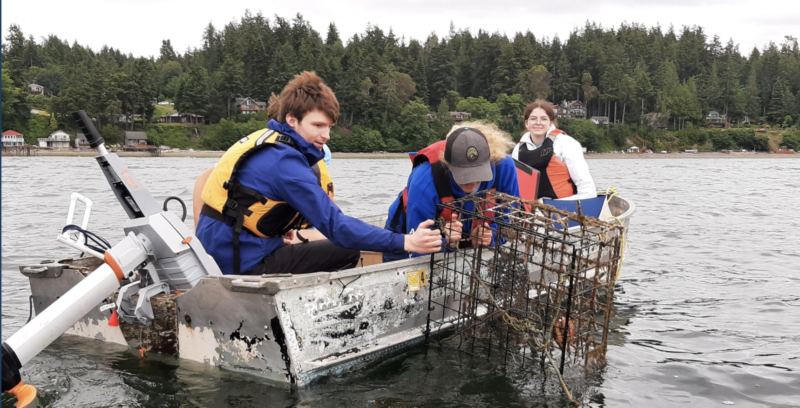
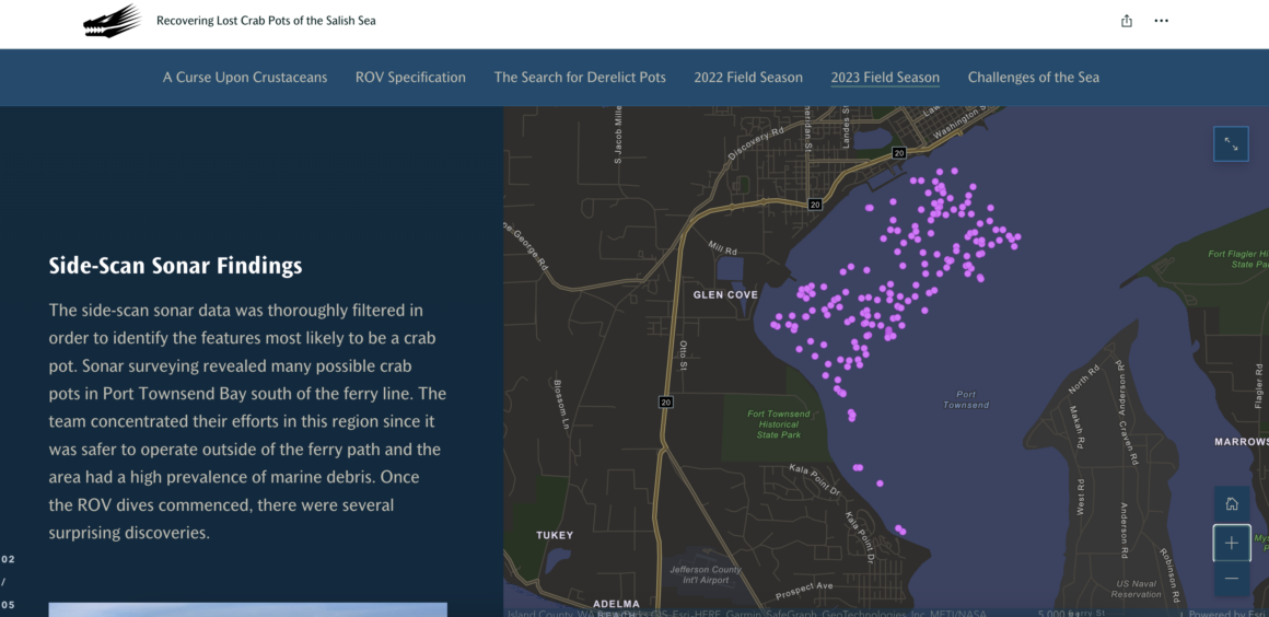
The student StoryMap is “Recovering Lost Crab Pots of the Salish Sea.” It presents the story of crab pots lost and found on the sea floor around the Port Townsend area of the Olympic Peninsula on the Puget Sound. You can see the StoryMap and follow all its narrative at the original site, here. The photo at the top of this post is from this map, as is this screenshot showing the location of sonar readings:
We’re excited to be able to embed the entire interactive StoryMap itself, as part of this post. You’ll see it immediately below this paragraph. You can scroll up and down within the StoryMap window to follow the story and see the innovative combination of images, videos, maps, and text narration. Place your cursor over the map window and move up and down within the presentation.
This StoryMap shows us points on the sea floor where lost crab pots were identified. It describes the real and potential damage that lost pots caused to the biodiversity of sea life (and trapped crabs!) and to the economics of the region. It outlines the local partnerships among people and institutions to design an experimental way to recover the pots along the coastal areas of this part of the Puget Sound.
It’s a story created by students, and engages students from nearby public school districts and tribal schools. The Sea Dragons, a student-run underwater robotics team, helped design the recovery process.
As with any new process, there were plenty of problems (tides, currents, weather, visibility issues) and surprises they encountered (discovering a recently-lost pot full of live crabs). Successes, false positives (concrete blocks, old tires), and failures. One discovery demanded a real-time decision about how to handle some long-lost, then found crab pots, which had become nurturing reefs for other marine life.
Partnerships brought the students together with Coastal Treaty tribes of the Olympic Peninsula, the Jefferson County Marine Resources Committee, research groups that had trailblazed crab pot retrievals in parts of the same waters, and various foundations and funders.
The GIS tools used throughout the story speak for themselves: look for and interact with maps, timelines, underwater videos, survey and data presentations.
The second winner, “A River Interrupted,” tells the story of how old, now-useless dams along an 80-mile stretch of the Charles River outside Boston have inflicted damage and invited risks to water quality, water habitats, fish passages, and neighboring human lifestyles and economies. This StoryMap presents the history and role of the dams, the changes over time, the prospect of exacerbating conditions from climate change, and calls to actions that citizens can take.
You can see the whole, fascinating map at its original site, here, or in an embedded version immediately below. Again, put your cursor over the map window, and then scroll up, down, and around.
As you’ll see, the map starts with a a brief history of the Charles River and its ecosystem, with vintage photos and a reproduction of an 18th century law about dams. More photos show how landscape that has been damaged can recover once a dam is taken away.
In this map we loved the catalog of fish types in the river, with images of the fish and brief profiles of their histories and migratory habits. If this were just a list of fish, or bullet points of a collection, it might have lost our interest pretty quickly. But this was charming—a running river of fish virtually swimming down the pages.
So many collaborators brought their work to this project. It was a regional effort of public, private, government groups.
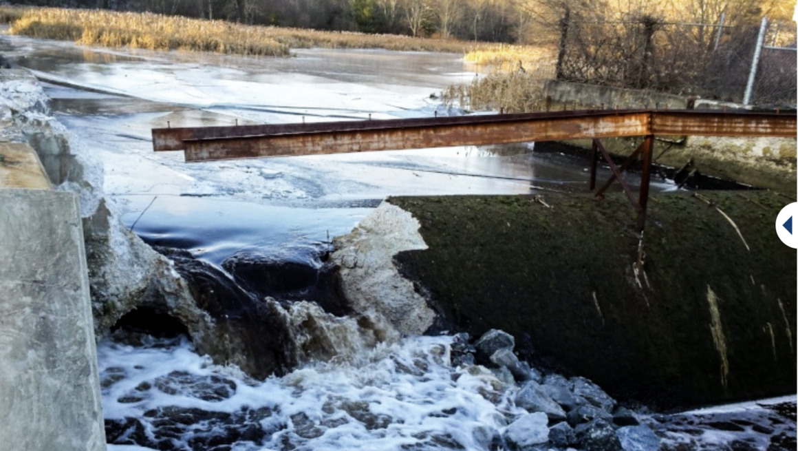
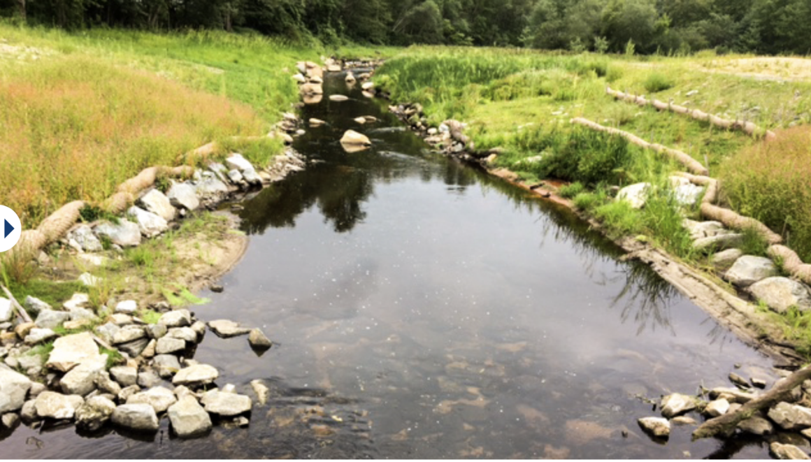
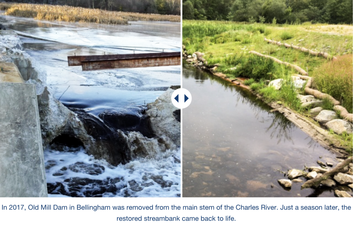
This StoryMap also features “swipe maps,” like the one shown in screen shots below. The first image is what the upstream Charles River looked like in 2017, before the Old Mill Dam was removed. The second image is how the same location looked just a year after the dam was taken out. And the third is a static shot of the interactive “swipe” view that lets you compare the two. In the interactive version of the map you can move the slider back and forth yourself.
Again, the tools of GIS transform a complicated and potentially tedious story into an exciting and dramatic read. The maps, videos, sound recordings, timelines, vintage images, before-and-after scenes, quick snapshots and profiles of the plenitude of amazing types of fish drive the storytelling.
To us, a valuable takeaway from good StoryMaps is their being inviting and accessible to many different kinds of audiences. StoryMaps are not for all stories; the tools of GIS apply better to some aspects than others. For example, they can shortcut complexities, like the explanations of the crab pot retrieval systems. They can display original perspectives, like what dams meant to Indigenous populations. A picture – or a map, or timeline, or creative graphic, or bit of audio – can be worth 1000 words.
These two StoryMaps are ambitious and well-produced. They are a gold-standard. But that doesn’t mean creating StoryMaps is out of the league of beginners. We at Our Towns were beginners when we tried out a few smaller-scale stories ourselves. As people who primarily write and illustrate words with images or pictures, we found it challenging to pare down words and seek other ways to show-and-tell stories beyond writing more words. It was finally rewarding and actually fun to do.
Congratulations to these winners, the many other entrants, and the countless communities around the world that will be inspired by their examples.

