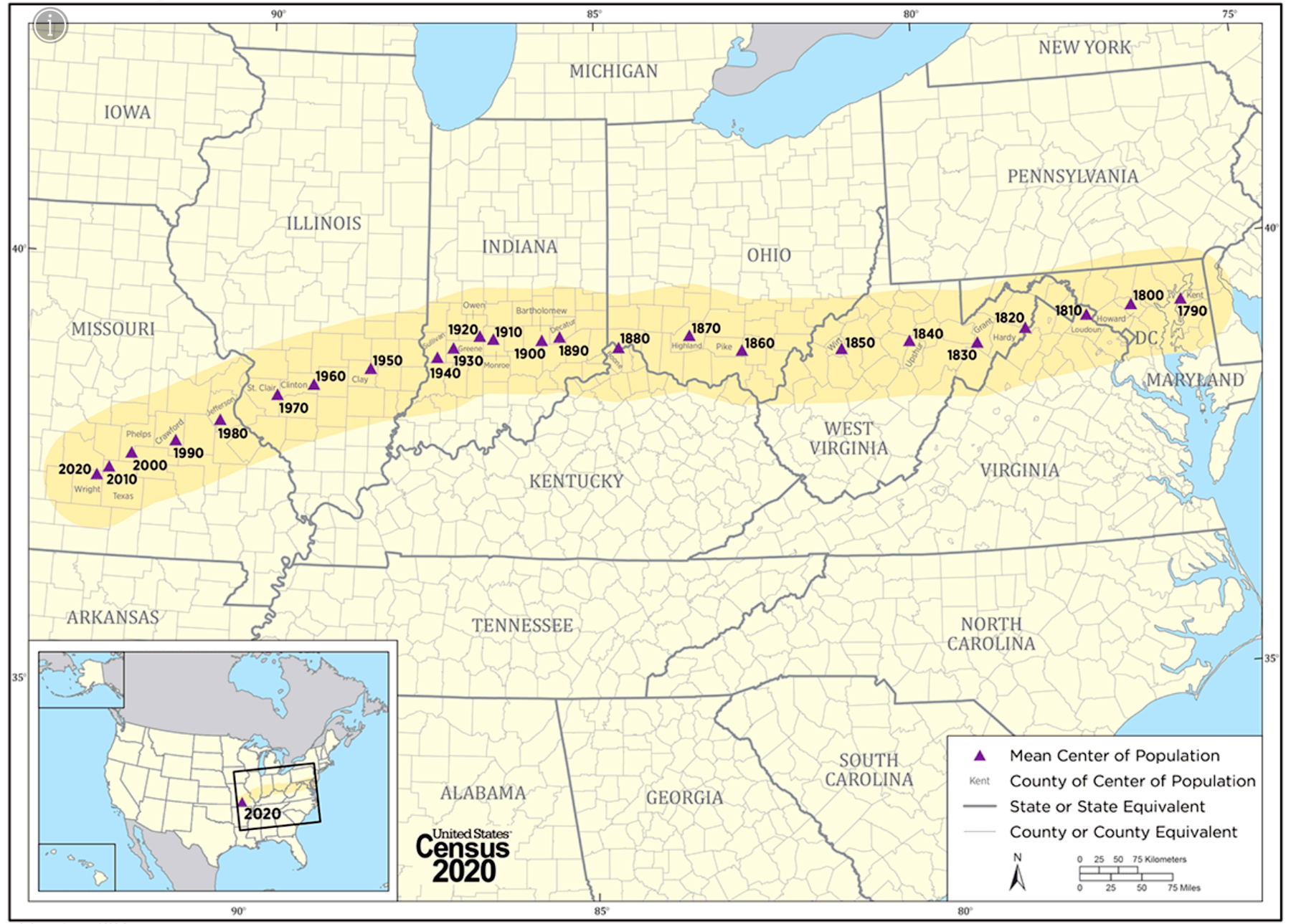
The post below is an updated and revised version of a new dispatch on my Substack site, Breaking the News. The post covers a wide variety of themes, from how the Census Bureau has used technology to track human settlements across the American continent, to how journalists and other story-tellers are trying to capture the balance between the crises of the moment, and the possibilities for renewal and response.
The obvious reason for devoting the first half of the post to a new Story Map from the U.S. Census Bureau is that it’s another illustration of the explanatory power of this “geo-journalism” tool. As with the two other government-produced maps I’ve written about recently, HEAT.gov and the new Climate Map for Resilience and Action portal, it shows the federal government using the unique scope and reach of its data to help families, communities, businesses, and others understand the challenges, opportunities, and choices they face. I am happy to say that these maps show our tax dollars at work. They also demonstrate the power of the Story Mapping technology that its creator, Allen Carroll, discussed with our own Evan Sanford recently here.
The second half of the post consists of links to people and organizations shedding light on the central question for any democracy, and particularly in the United States in our time. That question is how we understand the story of our times, so as to write the next chapters in the most successful way. Individuals, families, communities, states and nations, and entire cultures are guided by spoken and unspoken versions of where they stand in the arc of their stories. Who are we? What makes us unusual? What are the mistakes we can learn from, and the strengths and innovations on which we can build?
In one way or another all of the authors and leaders mentioned in this section are helping clarify the complex American story of these times. I have found it useful to read all of them, and I hope you will find them interesting and valuable as well.
This post is not on news of the instant but rather about longer-term shifts in America’s “center.” It starts with centrality in the geographic sense, and then gets into other aspects of how the country comprehends, and mis-understands, the center of its own emerging story.
First, geography and maps:
This summer I wrote about HEAT.gov, an innovative map-based effort to pool federal data about place-specific consequences of rising temperatures. I explained why I thought it mattered here.
Last month I wrote about an even more ambitious federal map. That was the new Climate Mapping for Resilience and Action portal, or “Camera.” Its purpose was to give citizens, businesses, political leaders, and others a sense of which climate threats were most urgent for their areas, and how, in specific, they could respond. Both maps incorporated the familiar but ever-more-relevant mantra about thinking globally and acting locally.
Now there’s a new map entry from another federal agency.
The changing ‘heart’ of America, as tracked by the Census.
The Constitutional provisions of 1787 have their ups and downs for the modern United States, as detailed here. But one of their purest blessings was establishing a decennial Census for a changing American population.
Through its existence the Census has been an irreplaceable trove of data. A minor illustration: this past April it released a searchable database of individual records from the 1950 Census, rendered in touchingly precise hand-written form. You can look up the name of anyone included in that Census here — as I did for my mother and father. 1 Why the 1950 Census? Because by law personally identifiable Census records are kept private for 72 years after the Census date. Thus the 2020 Census details are scheduled for release in 2092.
A few days ago the Census Bureau put some of its data to work in a very different fashion. This was in a fascinating “Story Map” about the shift in American settlement patterns since the late 1700s.
Story Maps are a narrative and explanatory tool for “geo-journalism,” which we’ve mentioned many times, including here. The technology was developed by our long-time friends at the digital mapping company Esri. A few weeks ago Deb Fallows and Michelle Ellia did a story map about the sea-turtle hatchlings of the Florida coastline—tiny creatures scrambling out of their nests in beachfront sand, along the very same coastline that has been pounded by Hurricane Ian this week.
The new story map from the Census Bureau uses a combination of historical narrative, map-based data, and overlays of economic, ethnic, and other information. Its purpose is to demonstrate how America’s population centers have changed, as the population has steadily grown.
Ever westward, ever south.
The main pattern shown by the map at the top of this post is the Census-by-Census shift in the “geographic center” of American population. This is the point where there are equal numbers of people on all sides; a more technical definition is below.2
For the first Census, in 1790, the population center was on the Eastern Shore of Maryland. As of 2020, it has made its way to southern Missouri. Its movement has been constantly west and slightly south.
The map below, also in the new Census presentation, conveys the same idea in a less fine-grained but also dramatic way. It shows proportional changes in state populations from 1950 to 2020. The states with the darkest coloring have more than tripled their population in that time. For reference, the total U.S. population roughly doubled over those years, from around 160 million to around 320 million.

The new Census story map doesn’t dwell on this point, but there’s an obvious correlation between where more Americans are choosing to live, and where climate-related consequences are worst: drought, wildfire, hurricane, extreme heat, etc. A great new geo-journalism project from the Washington Post illustrated this pattern in the aftermath of Hurricane Ian. Between 1970 and 2020, the number of people who lived in the path that Ian took across Florida rose by more than 600 per cent.
Here is one more illustration of how a government agency has used data and technology to tell a story. The new Census map has animated decade-by-decade charts of the penetration of navigation systems into the U.S. interior. Here at 20-year intervals is the change in water-borne (steamboats, canal traffic, etc) and railroad routes inward from the coasts.
First 1850, with railroads mainly in the northeast:

Then 1870, just after the Civil War:

Then 1890, with the rise of the industrial Midwest and the beginning of regular trans-continental routes.

In the Census story map, you can watch these networks expand along a timeline, with narratives about the effects they wrought. And then there are maps of how highways and freeways grew…
This latest federal presentation contains so much that I’ll simply say: congratulations to the historians and data designers at Census and their partners at Esri and elsewhere. Please check it out.
Telling America’s changing story, to itself.
In the wonderful Great Gerwig film Ladybird, the Saoirse Ronan/Ladybird character has a mocking response to the idea of “thinking globally, acting locally.” She says, “I don’t think that person lived in Sacramento.”
As it turns out, Sacramento itself has become hip—along with many other scrappy, reviving “we’ll show you!” cities we’ve written about, most recently Sandusky, Ohio.
But action anywhere, global or local, depends on assumptions about whether efforts could make a difference, or are just doomed. Which in turn rest heavily on stories about ourselves— on public narratives about the balance between possibility and despair.
Here are a few placeholder links worth considering, on the larger theme of how we imagine our possibilities as individuals and on a larger scale. Each deserves a long essay, but for now the links must do:
- From our friends at Cal Volunteers, a report on a civic-action day for climate-related projects this past weekend. It happened in the “we’ll show you!” city of San Jose, California. We’ve written about Cal Volunteers before and will follow its progress. It’s a very ambitious effort to reinvent a model of civic service and public engagement, in the nation’s most populous state. If this were happening on the East Coast or in political “battleground states” of the Midwest, it would already have gotten more press.
- I have known (and liked) Steve Case since his early days as a founder of AOL. People wear wealth and influence in different ways. He and his wife, Jean, have worn theirs in a public-spirited fashion. For years Steve has led a “Rise of the Rest” movement, to increase awareness of entrepreneurial possibilities away from big coastal centers. His latest book, also called Rise of the Rest, was published this week. I’ll hope to interview him about it.
- From the writer Michael Shapiro, in the Sierra Club’s magazine Sierra, a very good piece on how the nation’s capital, Washington D.C., led a surprisingly consequential local action, by banning the dirtiest machinery still in legal use—gas-powered leafblowers. Deb Fallows and I were involved in this effort, but main credit goes to allies across the District and in D.C. government, as named here.
- From writer Peter Yeung, a report about a tiny “zero-waste village” in Japan that has devoted itself to maximum reusability. This is from the Reasons to be Cheerful project, founded by David Byrne.
- From Chris Green in the Kansas Leadership Center Journal, an article on why “solutions journalism”—which treats public life as something more than a depressing spectacle—matters even more now than before. Don’t get me started.
- From our friend Tom Ruby, who has written incisively about localism for the Our Towns Foundation site, a chastening thought-experiment about the contours of a dis-United States. You can read it here; I plan to discuss it with him in a future podcast.
- From our friend Peter Leyden, a new article making just the opposite case on the Big Think site. It is called “The Great Progression, 2025-2050.” Here is a sample, with emphasis added:
“The time has come for a positive reframe of what’s really going on in America and the world right now, and what’s actually going to happen in the near future.…
“[The] slow-moving, pro-progress story is being missed by most of the mainstream media chasing the minute-by-minute story of crisis and decline. Yet all the pieces of this positive story are now positioned to be catalyzed: There’s a loose pro-progress movement that’s emerging through different sectors of politics and the economy…
“Here’s the thing about tipping points: When they happen, they happen fast… Some new trend will slowly grow in popularity on the fringes of society and once it gets enough exposure then — boom — everyone does it.”
A tipping point may be at hand. Toward chaos and dissolution? Toward a newly progressive period? Questions not to be resolved today, but centers of upcoming discussion.
1 Through this searchable database I found the records of my mother and my father at their separate addresses for 1950, although they were married. He was on Navy assignment as a medical intern and for Census purposes was a “lodger” at his hospital.

My mother was listed as “head of household” elsewhere, with an infant son.
2The Census describes the “population center” locations thus:
“The concept of the center of population as used by the U.S. Census Bureau is that of a balance point. The mean center of population is the point at which an imaginary, weightless, rigid, and flat… representation of the 50 states and the District of Columbia would balance if … each weight represented the location of one person.
“African Americans have always been counted as one person in determining the population center starting in 1790, even though prior to 1870 those in slavery were counted as three-fifths of a person for apportionment purposes.


